2025
10/18 (CFC)
Project
For this project, I designed the complete visual identity for 10/18 and adapted it into five animated back covers to entice readers to take an interest in the books. The whole thing was then integrated into a microsite designed to drive conversions. This work was carried out as part of my CFC project, the final exam for my school.
Design
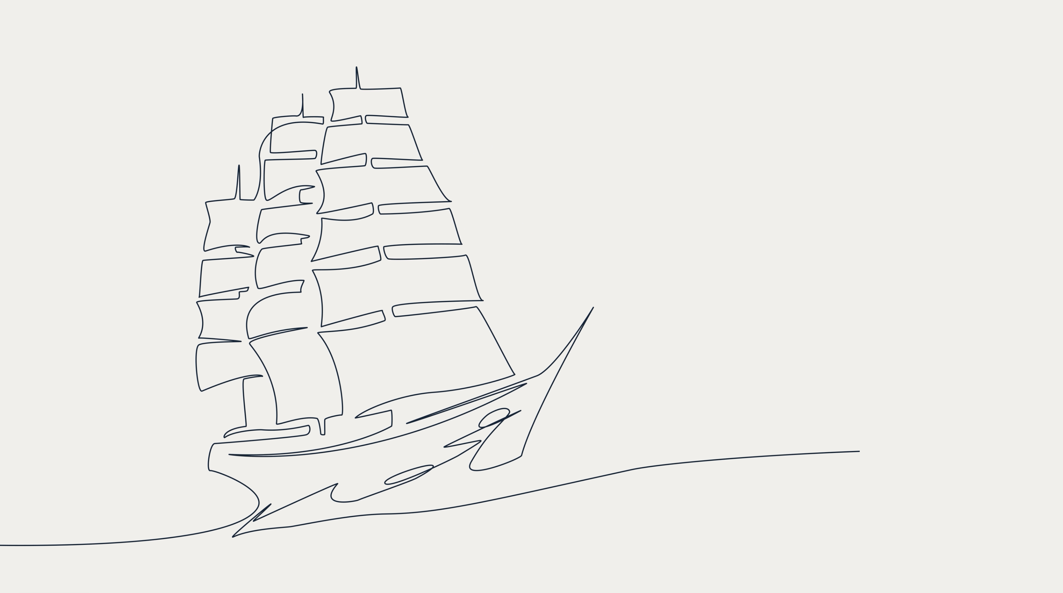
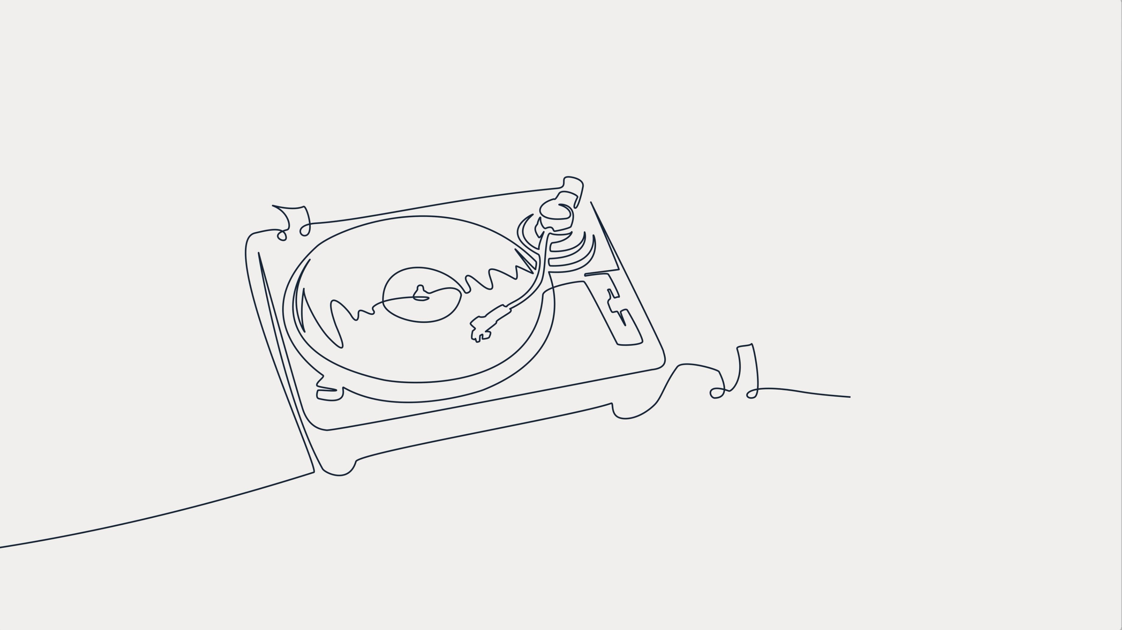
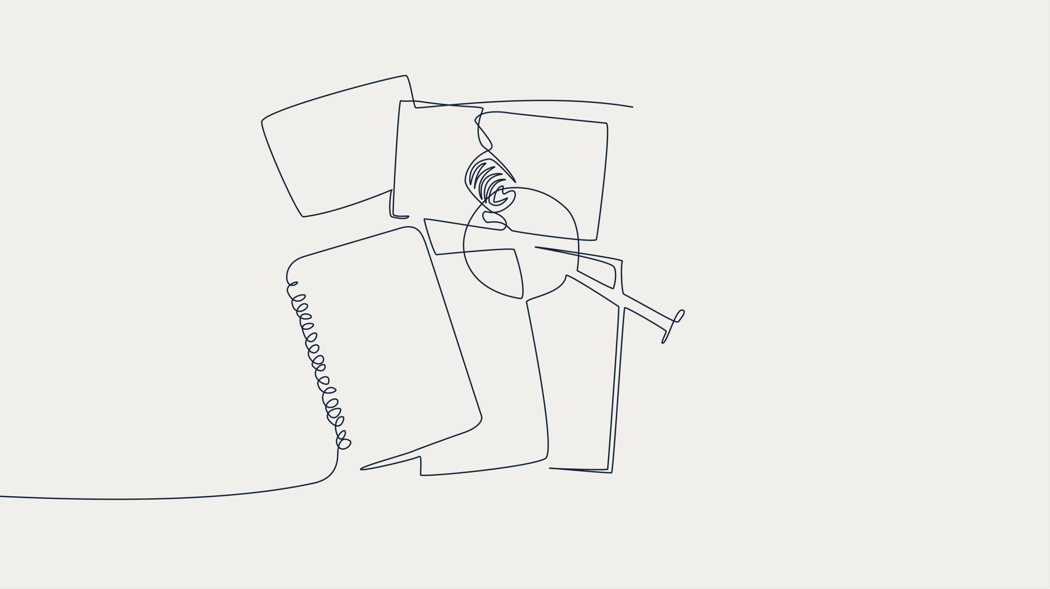
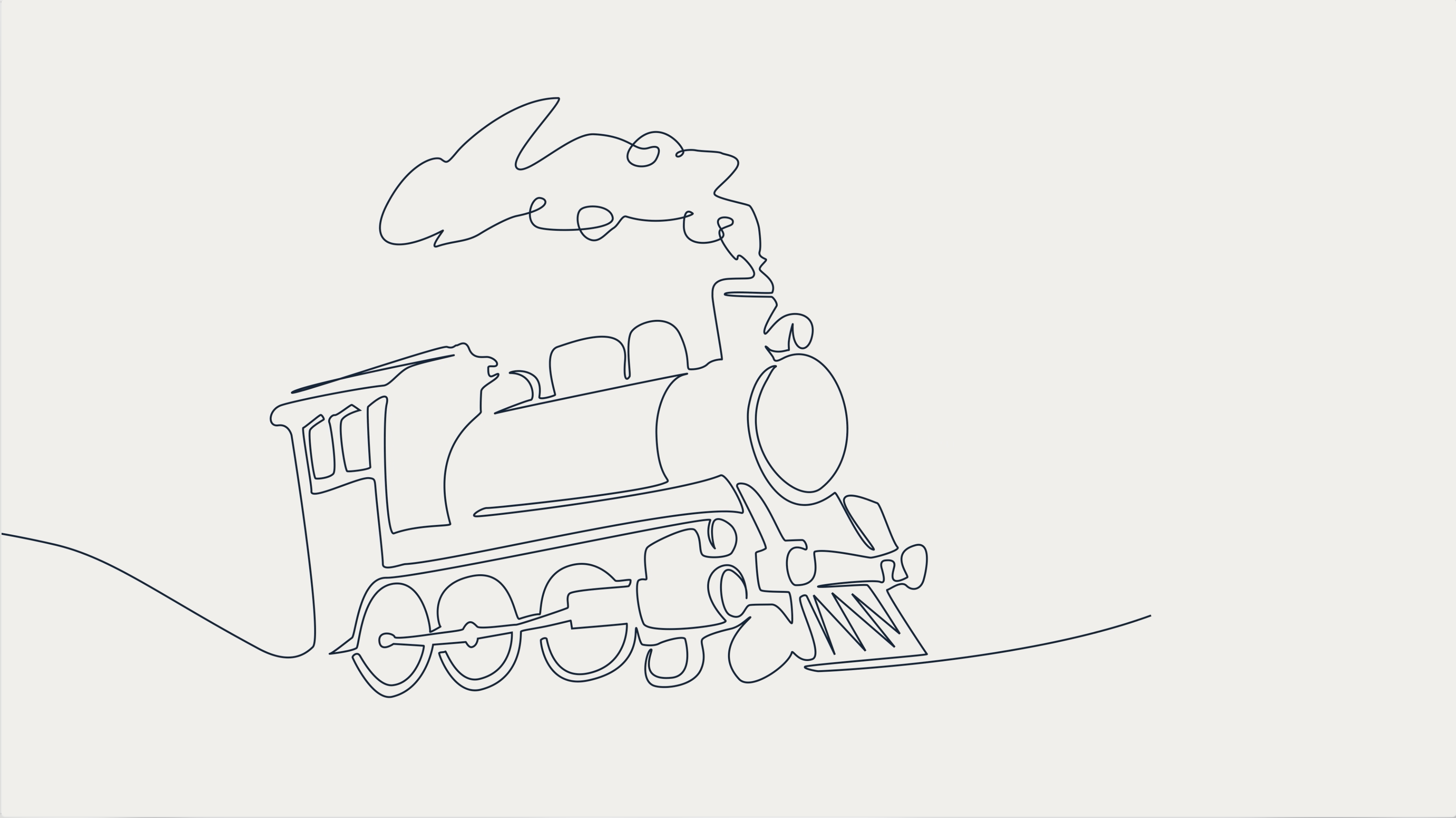
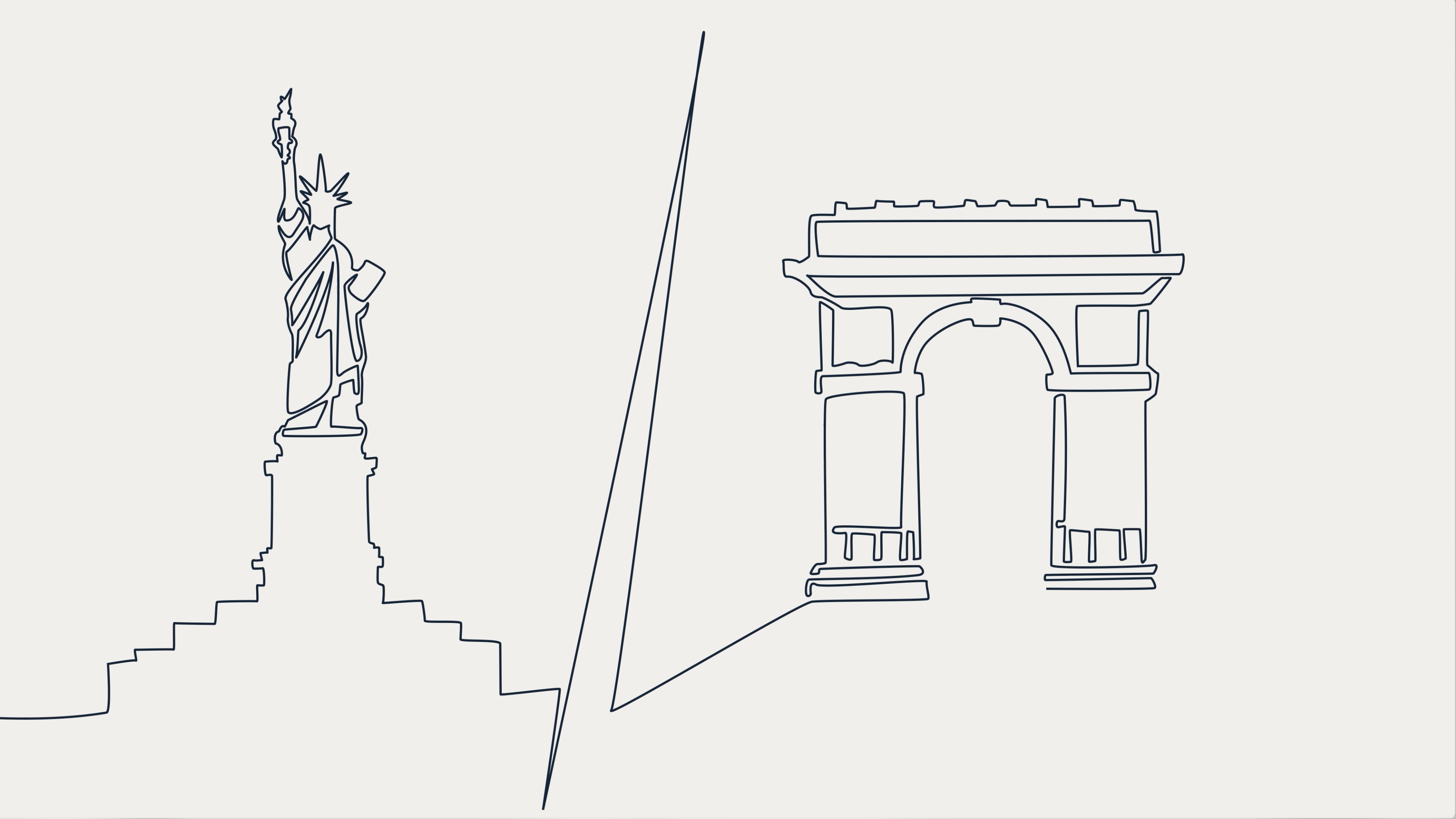
The design is based on a minimalist and elegant visual universe, inspired by the graphic identity of 10/18. The animation is created using a “one line” style, with continuous lines that flow smoothly and elegantly. This choice strikes the right balance between tradition and innovation. Tradition is reflected in the sober colors, reminiscent of the bluish black of ink and the white of book pages, while innovation is expressed through a unique and immersive animation style. The narrative is constructed gradually: the key elements of the book are revealed little by little, like a visual reading, without giving away the entire plot. The line becomes a common thread connecting objects, places, and atmospheres, allowing the viewer to immerse themselves in the world of the book. To enhance this immersion, the soundtrack accompanies the animation, incorporating sound effects and ambient music to create a complete sensory experience.
Stratégie
The strategy is based on a desire to remain true to the DNA of 10/18 while appealing to a wider audience. The goal is twofold: to maintain the trust of loyal readers by preserving the traditional codes of the book, while attracting a younger audience with a contemporary graphic approach. To achieve this, the animation does not reveal the entire story: it limits itself to presenting visual and audio clues, arousing curiosity without replacing the reading experience. This method encourages subtle immersion and gives viewers the freedom to imagine the story for themselves. The concept is also designed to be adaptable: it can be adapted to all types of books and can easily be integrated into the website, creating visual consistency across all media. Unlike a movie trailer, the animation does not seek to tell the story, but to extend the universe of the book, offering a visual and poetic extension that enhances each work while respecting its identity.
Results
The strategy stays true to 10/18's DNA while appealing to a wider audience. The animation, which can be adapted and is consistent across all media, does not tell the story but suggests the universe, arousing curiosity and highlighting each work without betraying its identity.
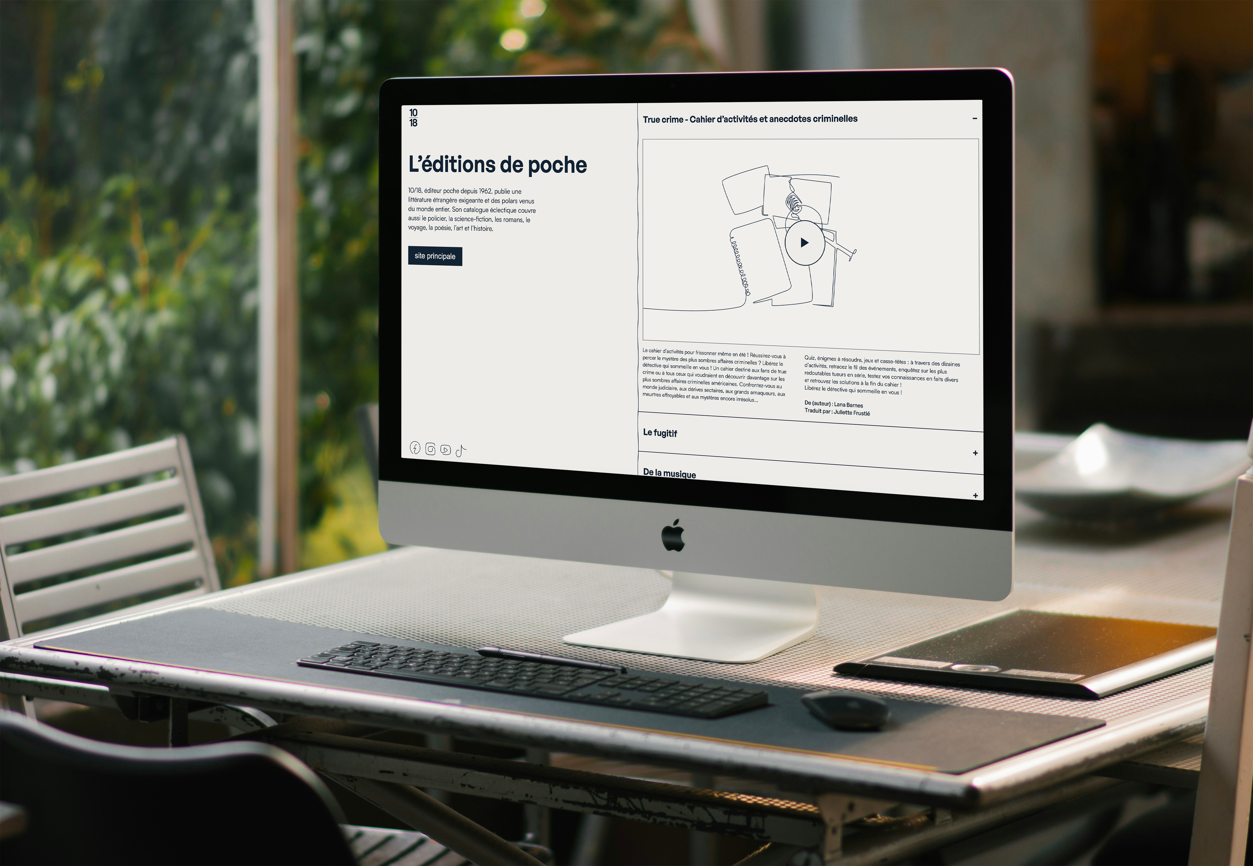
Web Site
I am creating a showcase website where the left-hand side, where the information is located, cannot be scrolled, while the right-hand side can be scrolled to view videos. The website's interactivity is based on an accordion system that allows users to discover animations through a progressive unfolding process. This evokes the experience of choosing a book from a library, while remaining practical thanks to simple navigation.
his evokes the experience of choosing a book from a library, while remaining practical thanks to simple navigation.
More projects